Logos
Third Eye Primary Logo
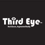
This logo was created for my Design Principles Augmented Reality company. The project tasked us with creating a variety of designs for a fictional company we created ourselves; these ranged from logos, web mock-ups, and stationery.
The primary Augmented Reality logo uses the typeface "Bauhaus 93" for "Third Eye" and "Myriad Pro - Bold Condensed Italic" for the tagline. Surrounding the text, is a representation of an augmented reality visor similar to what they would sell. In the center of the visor is a triangulated texture I developed for use with Third Eye branding. The aperture sign below the tagline is a camera used for recording information.


Third Eye Secondary Logo
This secondary logo was created for my Design Principles Augmented Reality company.
The secondary Augmented Reality logo uses the typeface "Bauhaus 93" for "Third Eye" and "Myriad Pro - Bold Condensed Italic" for the tagline. The top of "i" in "Third" has been replaced with an eye. This signifies the company’s work in augmented reality as well as their dystopian anti-consumer practices alluded to throughout their branding.


Equinox Primary Logo
The Equinox logo was created for my Print Production class. The company "Equinox" is the fictional print company we were tasked with coming up with and designing for.
The logo uses the typeface "A-Space". The type is surrounded by a circular outline representing the earth. Orbiting this outline is a red circle representing the sun.


Alex Tullio Primary Logo
My primary logo was created during my Vis Com Portfolio class as part of my personal branding.
I chose the typeface "Braggadocio", as my design style often makes use of similar geometrically constructed fonts when applicable. Surrounding my text are several different shapes helping to push the geometric style of the typeface.


Alex Tullio Secondary Logo
My secondary logo was created during my Vis Com Portfolio class as part of my personal branding.
I chose the typeface "Braggadocio", as my design style often makes use of similar geometrically constructed fonts when applicable. The bottom element provides a platform for the letters while also continuing the negative space present in the "A".


Alex Tullio Initials Logo
While also part of my personal branding, this logo of my initials was created during my Typography class for use on my design resume.
This logo uses the typeface "Futura PT Bold" with close tracking between letters. While I originally preferred the color scheme on the alternate two color logo, I found the addition of the light gray circle behind the text to pull the design together.
